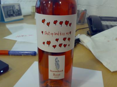
[One of the Stormhoek designs we’re thinking of doing for next Valentine’s Day. What do you think? Click on image to enlarge etc. Click here to see the old 2007 version on YouTube etc etc.]
After a very hectic year, I am pleased to say things seem to be calming down again [Yes, that would explain the recent rash of new cartoons. Mentally regrouping etc].
Three years ago, if you said my main gig would be selling wine to British supermarket chains, I would have said you were nuts. Funny how life takes you in all sorts of wonderfully unexpected directions.
My main focus for the next few months will be on drawing more cartoons and organizing more Stormhoek geek dinners. Everything else will take a definite back seat, at least on this blog. So like I said last week, if you have a UK-based geek dinner or event planned, and you think some of our wine would enhance the proceedings, please drop me an e-mail and I’ll see what I can do. Thanks Again.
I really like the labels. But then I also like the one’s that didn’t quite make the cut which say more to me about the reality of my life…
http://www.everythingability.com/django/picasa/drawings/Crap20.jpg
I like this, but there were some from last year that made me weak in the knees.
Love begets love, for one.
But would I buy this if I saw it in Chicago? por supuesto.
Love it!
Very good – I like that there are 2 labels there, the message and then the product label itself. Some of the humor you guys are doing reminds me of things that the Bonny Doon winery used to do about 10 years ago. If only I drank rose.
Me likes … the little hearts and the sentiment expressed.
I really like the art. ON THE BOTTLE however, I think the secondary lable should be much smaller. nice stamp looking thing, not quite so large.
As we discussed face to face, my one quibble with last year’s great label was that due to time constraints I imagine, it looked as if it had been slapped onto existing bottles (i.e complete with the other labelling) rather than being a special edition. Given there is more lead-time this year, I wonder if you could look into incorporating the Stormhoek name etc into the cartoon label (not within the cartoon per se but perhaps underneath it) so as to avoid that impression?
Weird, John. The cartoon WAS integrated with the label last year. So your comment kinda leaves me scratching my head.
With this current design, believe it or not, a lot of the design function depends on which paper we choose to use to print the labels on.
Semantics rearing its head here I think Hugh – what I meant was that the silver Stormhoek badge was distinct from (although I accept it was physically connected to) the cartoon and for me that was a little jarring. Having a cartoon label and a standard Stormhoek labelling was a bit schizophrenic for me.
I suppose I’m going further than John James above in suggesting that the cartoon should be the only label and that any identification of Stormhoek (that might facilitate later purchases) would flow from something within it or perhaps just from the rear label.
That said, the one you feature on this blogpost looks better than last year’s one in this respect.
I think Ewan McIntosh might of contacted you about group of us from the Edinburgh Coffee Morning holding one?
http://www.facebook.com/group.php?gid=3477420821
Jamie
lol hahahah no!
Fantastic – very beautiful and lovely
That design is so cute! I love it.