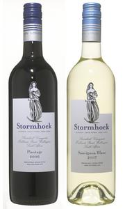
[The new Stormhoek front labels. Click on image to enlarge etc.]
[The new Stormhoek back label. Click on image to enlarge etc.]
After many months in development, Stormhoek has finally got its new label designs.
The front label is a fairly classic look [our customers like that a lot]. We had a ball, however, with the back label. Notice how we put both the Blue Monster logo on the back [without any explanation], and also, the Unofficial International “Hacker” symbol. Oh, yeah, we also borrowed the “Change the World or Go Home” tagline from the Blue Monster [Disclosure: gapingvoid is more evil than Microsoft. Just so you know.].
The vast majority who see our wine on the shelf have never heard of us before, have never read gapingvoid, and don’t know us from Adam [The same is true for the vast majority of other wine brands]. So most of the marketing is done on the supermarket shelf. It’s actually pretty intense, thinking about it all.
The funny thing is, people in the trade like the back label SO MUCH there’s already talk happening about Stormhoek being the first wine to have itself stacked on the shelf with the back label facing frontwards.
So the Stormhoek hook becomes: “The one with the back label on the front”.
I love that idea… We’ll see what happens.
[UPDATE:] I’ve just learned- the new design will be arriving into the UK at the end of this month [November]. Expect to see them around the supermarkets [Tesco, Asda etc] soon after.
Love em!
The back label is very cool and you are right that people are going to pay more attention to that side then the other.
I still can’t wait till they start selling this somewhere in New England. I had the chance to have a bottle once and enjoyed it completely!
Woah! That’s got to be just about the coolest thing I’ve seen in a long time – on so may levels! You must be very happy. Good work.
The back is far more interesting, if they shelve it back facing doesn’t that become the front? š
Thats definitely an awesome label
now where can we buy some? š
I assume the usual suspects should all have some soon enough?
great idea – I must admit I’ve never looked for your wine on the supermarket shelves … must check that out and give it a whirl .. I’m trying myself to get into wine more …
Nige
LOVE it!
Both back and front.
It says to me…
“At first glance,
I might look traditional
but if you look behind the facade,
I’m anything but”
Very clever.
Looking at it on mobile internet, I realized that the blue monster and the hacker symbol are mirror images.
In an abstract, low res, sort of way.
I look forward to trying them, Stormhoek are producing some great wines! And great labels š
Hugh,
That back label is sensational. It has suprises all over ir right down to the Blue Monster. As you read it you are greeted by stuff that don’t belong anywhere else except on that battle of Stormhoek.
I think the “change the world or go home” line is absolutely great and so apt and positione in the right spot. All the back label stuff is exactly where it ought to be.
You did change the wine world Hugh. Yessir indeed you did.
As one of the guys on the frontline talking the feedback good and bad what I like about it is the way that the back label connects with decision makers who aren’t exclusively ‘handcuffed’ to wine. Those who see marketing ideas from lots of other sectors – food, non food. That makes it truly, originally amazing – like nothing else that I have witnessed in 22 years of working with wine!
funny I found the label to be very disappointing. The front, although classic, will blend in on the shelf – maybe thats why the back is perceived to be the front.
I also found that the back label is trying to hard – almost trite. It’s recommending to the consumer how they will/should feel as a result of buying/drinking this wine. Rather than extolling the virtues of the wine paint a picture, tell a story that makes me feel passionate, spontaneous etc.
How about:
“Drink me
Get Pissed
Have Sex”
That I can relate to!
Any chance of getting a bigger image of the back label, these old eyes can’t quite enjoy the small print at the bottom
I scanned the pictures before I read the text and actually thought the back label was either another type of white, or a rejected idea for the front label. I found myself liking it more.
Big happy words set in big type. Made me want to try one.
read and sunrise
http://www.marcvidal.cat/en/images/2007/11/13/12_11_2007_0250051001194895309_jaso.jpg
a coffe with hillary… š
But even after I change the world, I’m still going to want to go home and relax with a nice bottle of wine! š Great label. Spells out joie de vivre … congratulations, Hugh.
can’t wait to sample this stuff in the UK. Looking forward to some merry blue monster fun =)
What I most love is that this would never, ever have gone through any standard marketing committee or decision process. Brilliant.
do you consider westknollendam 85 1525 PR west-knollendam (near amsterdam, the netherlands;) as uk based? (if not, you than already have my address when you decide to go worldwide;)
thx in advance,
Pixites
I can’t believe you’re happy with this arrangement. So the punter HAS to take the bottle off the shelf, turn it around to see a message only a few people understand? Where’s the differentiation on the front label? Sorry Hugh but this doesn’t fly for me. But then you already know I’m an idiot when it comes to marketing.
Well, ya know, Dennis, it’s the same ol’ story with you and me…
“Dennis Howlett doesn’t like it!”
“Then it must be good! Hurrah!”
š
Yeah – and I also said Twitter is the biggest waste of time man ever invented…I’m kinda memorable like that. But then I’m also an average buyer.
avqwjdb axhirnvgb oamyfqgwk bwxls vrycl hqztk lcqx