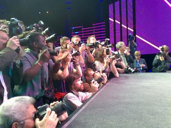
[The paparazzi getting in their photo ops etc. Watching them was somehow more interesting than watching the sporting celebs on stage.]
My friends at Edelman kindly invited me this morning to the “Brand Launch” of the 2012 London Olympics [No, I wasn’t paid. Just so you know]. Here are my thoughts, in no particular order:
1. Anybody who’s ever studied the Olympics knows what a huge political and economic undertaking it is. Frankly, I find multi-billion dollar exercises in good intentions a bit off-putting. I mean, look at The Millenium Dome. That being said, if they manage to pull iit off, it’ll create thousands of sustainable jobs for Londoners, not to mention re-develop the whole east end of town.
2. The event was very slick and stage managed. Quite unlike the geeky conferences I go to. You could tell all participants rehearsed their script for weeks beforehand. But hey, the stakes are high, so what the heck…
3. Sebastian Coe, the 1980 Olympic Gold Medalist and front man of the London Olympic Committee, is actually very good at his job. You can tell he passionately believes his own schpiel. With this kind of thing, it’s easy to be cynical. The hard part is being sincere, not to mention, effective.
4. From what I understand, they originally pitched it to the Olympics Committee as “The People’s Olympics”. Living in a basically liberal, tolerant large city of 10 million people, I can’t say I’m surprised. What I did like about their reasoning was that their schpiel wasn’t so much, “Let’s use the Olympics to inspire young people to find their own greatness via Sport”. Their schpiel was more, “Let’s use the Olympics to inspire young people to find their own greatness… within themselves. Doing whatever it is they do, not necessarily Sport”. I actually thought that was quite clever. In a good way.
5. I’m not used to these mega-huge, super-slick PR events. But it was interesting to see. I actually came away far less cynical than I had originally predicted. So good luck to them.
[UPDATE:] Seth Godin is not impressed:
If you are paying money to someone who talks like this, may I suggest you stop? And if you work for someone who talks like this, time to look for a new gig.
I know what he means. When large, highly-idealised, expensive political schemes start going on about “The Brand”, “Inclusivity”, “Excitement”, “Passion” etc, it all gets a bit cheesy [Like I said, remember the Millenium Dome?]. But I disagee with Seth re. the 2012 Olympic logo. I quite liked it when I first saw it.
That’s great Hugh, but let’s get to the juicy part… What do you think about the logo?
What do you think about the 2012 logo they released yesterday?
http://news.bbc.co.uk/1/hi/magazine/6719805.stm
Hugh, I agree with you more often than not…. but… man, that logo is atrocious. mmmm…. maybe this is all part of the evil Blue Monster Microsoft gig…. launching a logo on the world that was clearly designed in the original version of MS Paint, etc.
It’s dead in the water – associated with ridicule in the public mind. No wonder when people like this are involved.
Olympics Minister Tessa Jowell commented: “This is an iconic brand that sums up what London 2012 is all about – an inclusive, welcoming and diverse Games that involves the whole country. It takes our values to the world beyond our shores, acting both as an invitation and an inspiration. This is not just a marketing logo, but a symbol that will become familiar, instantly recognisable and associated with our Games in so many ways during the next five years.”
When any scheme starts going on about “The Brand”, “Inclusivity”, “Excitement”, “Passion” etc, it all gets more than a bit cheesy.
Huge missed opportunity for me – looking at the quality of people-generated logos on the BBC website, they should have run some sort of national ‘create the logo’ competition. Great PR, buy in from all and sundry, etc… as it is, for me it says unimaginative, bureaucratic, overinvolved client. Dome II, anyone?
Al, given the vast myriad of special interest groups, committees and quango’s the logo designers had to pass through, and get out in one piece, it’s amazing a logo got made at all.
Secondly, I doubt there is any logo that people would’ve liked…
Agree re letting the people have a go at designing the logo for the “people’s Olympics” – if this is what the pro talent can do, give me user generated design anytime 😉
That logo is no doubt ugly, but Hugh does make two valid points. An image made to please everyone and their cousin must have died before inception itself. Given the scale of the event, it really doesn’t even matter what the logo is.
There’s no point in pretending that there’s one voice when so many different people have been and are going to be involved in creating this ‘brand'(if thats’s what they choose to call themselves). Fundamentally, the Olympics are about sports and I don’t think any sportsperson would give much attention to this.
Anyway, they say it’s got in much more money than was spent on it. Of course, no one’s going to look at the logo once the media flames die out. Plus, half a decade should be enough to forget all about it.
Hugh,
Anyone who reads my blog has probably figured out that I love design but am not a design snob. With that context, I have to tell you that I’m stunned this logo was chosen. My beef with it aside from an aesthetic dislike is that it focuses on the wrong things like:
“The new emblem is dynamic, modern and flexible. It will work with new technology and across traditional and new media networks.”
what??
I’m lost. I thought this was supposed to be about the Olympic spirit and London coming together in 2012.
I could be wrong here, but I think something went awry in the design process.
I wrote about it on L+E if you’re interested…
If you think the London logo is bad…check out the logo for our 2010 Vancouver games. It’s an Inukshuk – a native rock structure that is mainly seen in the North. Not only is it a horrible, cheesy, no-style logo, it also gives the West Coast natives a huge smack in the face. We have so much great West Coast native art (totem poles, masks, etc.)…why did we have to use a mainly Inuit icon?
Now they be animating the logo!
*WARNING* NSFW (not safe for work)
http://theospark.blogspot.com/2007/06/london-olympics-logo.html
‘living the brand’ I would say. 🙂
I’m reminded of the Sex Pistols….not sure that was in the brief!
Not keen on the animation but much of hysteria around the logo is way over the top. It’s expensive and it’s not wonderful but I’ve seen worse!
Danni